Wednesday, 27 February 2013

Food Photography

@ Colours Restaurant 

We had the opertunity to take images using studio lighting in the college restaurant with food prepared by the Hotel & Lesuire Students.

We set up the lights around the tables that had been set up for use in preperation for use to be able to get the right light if not using natural light! 

Here are my images taken from the Restaurant using Canon 40D ISO 100 - F8 - to F4 shutter 125th


Here are examples of food photography that I have found on the Internet similar to the images I have taken in the restaurant.


The lights used on these images is brighter than the ones I have done they may have more natural Light or they look like they have edited later in Photoshop to sharpen & brighten their image.


Wednesday, 13 February 2013

Examples of different lighting used


Examples of different images & the lighting that we used to        create the same look in the college studio


Picture 1,


Here are the originals that we looked at and then my example's of them that I have taken after we had set up the lighting in the studio ourself and set our cameras


Example 1, 


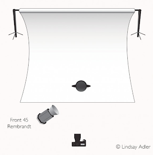
Model on sat on a chair in the center of a dark room. 
Legs crossed and same body angle!

Beauty dish light used on a 45 degree angle with a slight dark reflector of the corner of the light to get darker shadows. 


Picture 2,


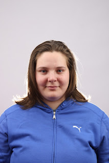
Here is my picture the same as this one using similar lighting in the same position.


Example 2, By Julie Morrison


 Picture 3


Example 3, By Julie Morrison


Picture 4,


Example 4, By Julie Morrison


Picture 5,


Example 5, By Julie Morrison


Picture 6,


Example 6, By Julie Morrison


Rankin


Rankin is predominately a fashion photographer who works works mainly in a studio or on location


Here are some of Rankins fashion images taken within a studio!

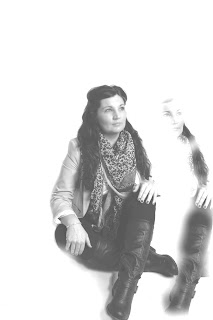
In the top image we can see that Rankin has worked in a studio and used a white back drop with high key lighting around the model. The lightness of the models skin tone works well against the her dark hair and the make up & mask that she has on.  Rankin would of also had an assistant to get the movement of her her or a fan was used. I don't think a reflector has been used but a beauty dish may have been.

On this image here the light is more low key on the model in the boots. This creates a better effect and suite the style of clothing the model has on.  Rakin would have used two lights at each side of the model and possibly one more forward to the right to get the skin town light on the body but not too bright to lose the showing to the right.

on the image below the light is directly on the front of the model and not to the back of her as its black.  I would have guessed that there has been a beauty dish used with a honeycomb light to add texture & depth in this picture.  The light is straight on the model & there possibly a white reflector under her by her chest to reflect the light up to her face.


Gregory Crewdson

Gregory Crewdson's Images


Gregory Crewdson uses staging and lighting to create his images to such a powerful story.  These two images are from a collection of the Twilight Series in where he has had both a creative intent as well as a client requirement.  Crewdson's other images in the past have come from dreams that he has had or life encounters things that where going on in his life effecting his state of mind and then re-creating these dreams into images and works of art.   


ttp://www.nowness.com/day/2012/7/5/2263/gregory-crewdson-beginning - this is a short video on crewdson and where some of his ideas come from.

David Le Chapelle


David La Chapelle - Model image with use of light from the sky and large window to reflect any light bouncing from the right hand side. In Davids model shoots he tends to capture bright, strong edge vibrant colours to make the image stand out.


Again here in this image both natural lighting & studio lights have been used.  David likes to use strong colors and strong pose in his images. The location for both images is interesting and the composition is also strong and sharp. 


After returning to art David La Chapelle produced Earth Laughs in Flowers these pictures where shown in galleries around the world at the same time! The images portray human vanity if you look around the flowers there are various everyday products we use and waste even things that you see or do in your everyday life! The light is directly on the vase with a dark background reflecting what’s underneath the vase up towards your eyes.


Tuesday, 12 February 2013

High & Low key photography

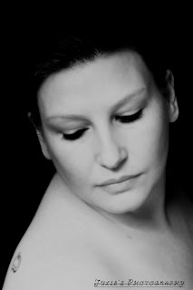
High Key Images taken by Julie Morrison - ISO - 100 - F8, 1/125th  Canon 40D

Lights used - 4 x lights 2 x soft boxes and 2 continues lights.  The backdrop is white with little light in the room apart from the studio lighting.


Model - Amanda - close up soot of her eye with heart shape around the eye for creative intent.

This image has been edited in photoshop by myself.  I have used CS6 Photoshop, cropped the image slightly, then I have upped the brightness. I have then used the clone stamp to remove parts of Amanda's hair at the top left of the image as the hair was a bit fussy.  I have then used the Gaussian blur tool to blur the skin and give her a smother texture to make the image better.  to then make it stand out more I have used the Laos tool around the eye and filled it in green then adjusted it to a low light.


Another example of High key at Home with my own studio - 

Umbrella light used at the right and a soft box to the left.  Some natural light coming in from the right hand side.  ISO - 100, F8, Shutter 1/125

Model - Wendy - My Sister - Close up of her head, neck and shoulders looking over one shoulder towards me and with her eyes looking down.  Wendy has a pieced look when the images have been taken however in this image she is more natural and the mood it relaxed.


Again this image has been adjusted later in photoshop CS6. I have upped the contrast, cropped the image and changed the level's on the image to get the black background.


Low Key Images - 

Image taken with a canon 40D - ISO, 100, F8, shutter 1/125

Model - Amanda- Low key image darker more shadows.... This image has not been edited yet.


Model - Lydia - Image shot with two soft boxes to get a low key picture however when editing I have exposed the image more and now it looks more High Key.  I have also painted her nails using CS6 Photoshop by using the Laso tool and then filling the colour in red.

Monday, 11 February 2013

Product Photography

In this unit we have been asked to take images for the Graphic Design Students and their Coffee cups and logos that they had designer, Food that we had brought into the studio from home and Flowers from the florist department in the college.

All images taken in the studio My camera Canon 40D - ISO - 100, Shutter speed 125th, aperture F8 to F16 depending on the mood and angle taken.

COFFEE CUPS & LOGO'S - Graphic Design Department

Images - Julie Morrison & Edited by Julie Morrison


Using landscape & not portrait to shoot with this image to get the angle right for the product. If you space around your area so that your product sits right in the image giving a better effect! I got in close and level by sitting on a stool to get close to the product.  I have later edited the image and upped the contrast & saturation tool on photoshop.

I have done the same with the image below however its not straight on and I think it would have looked better if they where in a straight line.


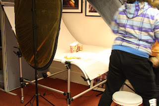
Here is the product table set up ready to shoot & allowing room for an assistant if needed to get under the table and shin light for more effect if required.


Both images have been shot on a small product table with a red velvet cloth to add effect. I struggled with these images as the transmitter for the light wasn't working very well and I was unable to get many images. I have used a dark card on the image above to get a darker mood with the flower being for a funeral & then I have tried to get a more abstract image on the bottom one by taking the picture from a closer 45% angel.


Here are examples of other product photography with similar products that I have found.


These Images have been placed on a product table with a flash light to the left of the cups and on the top one it looks as though there may have been a light placed below the cups to get the back light. 

Client & Creative Intent - Prezi

10 Minute Prezi relating to Client & Creative intend by Julie Morison, Karl Raven & Stephen Williams

http://prezi.com/bo4rxna5tlba/unit-25/

In this presentation we have discussed the differences between Creative & Client Requirements along with the characteristics of both requirements.

Looking at other photographers work including - Rakin, Craig Cutler, Gregory Grewdson and others.

This presitation is still to be presented to the rest of the class in our groups towards the end of the unit.

Strobe Photography

Strobe Photography mine & Key practitioners work


Harold Egerton -


Harold Egerton - Master of High speed photography! Harold Egerton is world know for his scientific & high speed photography shoots. Here in this image he has captured the movement of a golf club being swung at a fast speed yet it's captured every movement and movement of the club with the speed of the flash light...
 
 
By getting the timing right and the position of the apple Harold was able to get this fantastic image of the bullet passing through the apple and coming out of the side!  In this unit we have been experimenting with strobe photography and I have managed as a group to get the following images.
 
 
Timing is key by setting your camera to ISO - 100, Shutter speed 1/60th and my aperture at F8 I was able to get the following images when experimenting with strobe photography.
 
 
Here we where dangling a balloon filled with water, with one person behind the camera, one popping the balloon and the other hitting the strobe light! This take a few attempts but once you get it right its worth the wait and the images are fantastic! As the camera is exposed we counted 1,2 & one 3 I would hit the strobe & the other person would pop the balloon.  In this go we also used a light around the balloon to create more of an effect.

Here we where having a go at dropping into a small tank filled with water. Again working in groups of 3 and getting the timing correct can give you a fantastic image.  This image can be improved in photo shop with some simple adjustments light the contrast and making the bubbles look lighter.
 
In order for the images to be taken we had to set up 3 different tables and work spaces including lighting & props.  Here are the images of the different set ups in the studio on the day we had of strobe photography.
 

Here are the set up tables that we used on the day of the strobe photography class

 
 These two tables where for the balloon popping & strobe

 This is a set up for the dropping in the tank - Using the product table and a beauty dish with strobe light.